
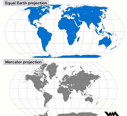
Every few years, wisecracking cartographers unveil some new map projection promising to fix how we visualise the world. The Equal Earth projection, introduced in 2018, is the latest attempt to correct the distortions that sometimes mislead or supposedly offend. It is mathematical, smooth and demonstrates equal area as advertised. But Equal Earth feels like a beautifully engineered solution to a problem most people do not care about, undermining the centuries-old Mercator projection and forgetting how much it has impacted the world for the better. Even so, when it comes to solving the way people relate to maps, there are far better projections that demonstrate this and are, in many ways, much superior.
To understand this, one must consider what modern world maps are for. We don’t live in the colonial age when we needed maps to travel on years-long trade missions. We don’t live in the Cold War when governments fed their citizens propaganda through maps. Today, maps are largely a way to visualise the globe. We relate to them through usefulness, readability, and aesthetics.
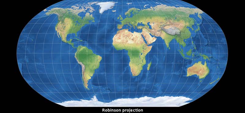
For example, the Robinson projection, created in 1963, was designed with one simple goal in mind. It wouldn’t be perfectly accurate; it wouldn’t push an agenda of control or equality. It would simply provide a visually balanced way to understand what the planet looks like. It smooths out the harsh distortions of Mercator, softens the enlargements at the poles, and produces borders and continents that are recognisable and feel memorable to the human eye.
To prove its credibility, it was adopted by National Geographic for 10 years because it struck the ideal compromise that Equal Earth now claims, but better. It was meant for classrooms, posters and encyclopaedias, places where maps are most directly and relevantly engaged with, and where clarity matters much more than dogmatic mathematical purity.
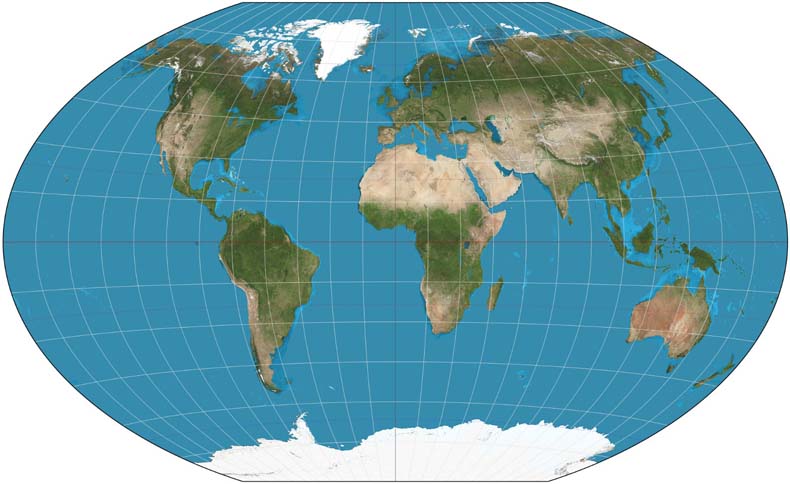
Then the Winkel Tripel projection replaced the Robinson projection as National Geographics default map in 1998, refining its predecessor’s philosophy. “Tripel” refers to its three minimisations: area, distance, and direction distortions. It makes reductions in everything that makes flat maps misleading. The result isn’t equal-area or conformal, but a hybrid that is among the most visually accurate. It is more recognisable and, in any case, a great compromise between older, more famous projections and more modern, hyper-accurate maps. National Geographic switched to Winkel Tripel in 1998 and has stayed with it ever since. That alone tells you something: cartographers who publish maps for millions of readers chose balance over ideology.
Equal Earth, on the other hand, to some extent forgets other nuances, balances, and compromises in cartography, building its design entirely around equal area. Every landmass is perfectly proportionate. However, equal-area projections are nothing new. They already exist in abundance, such as Mollweide, Eckert IV, Goode’s Homolosine. Equal Earth may be accurate, but it isn’t all that different from these maps when you look at them. Furthermore, in many people’s opinion, these kinds of maps look a lot less attractive than the compromise maps I have advocated for. Equal Earth is not conceptually new or special, as we are often told. It is a refinement rather than a revolution. This isn’t to say aesthetics was completely ignored in the making of this projection; just other projections do it better.
 More importantly, the problem Equal Earth claims to solve—that people are viciously misled or offended by unequal maps, is largely fictitious. No one feels like their nation is being dishonoured due to its true size not being fully reflected. No one is suing cartographers because their map doesn’t show South America’s true scale. The average map reader is not emotionally wounded by Europe looking slightly larger than it should.
I am not denying the fact that maps can be used to cause geopolitical harm or offence. For example, the Gall-Peters projection was adopted by many simply because t distorted to shrink former colonial powers, marketed as an anti-colonial corrective, which simply misled further. Similarly, Google Maps distorts borders and changes names when used in China to keep the authorities happy.
Today, however, the urgency of creating a map that spreads a message through its projection is virtually extinct in most of the world. What matters now is how useful it is to the average person. This is where Equal Earth feels unnecessary. It solves a problem that modern map users no longer face. It offers justice to a medium that no longer shapes worldviews. It is a beautifully crafted projection that arrived after the conversation had already moved on.
There is another issue Equal Earth cannot escape from. To the normal person, shape matters more than size. Yes, it is important to have a compromise between both, as with Winkel Tripel, but fundamentally, people remember what the world looks like through shapes. Equal Earth gives Africa and South America their proper area but sacrifices shape accuracy and the iconic nature of these shapes as well. Coastlines bulge, borders warp, and famous silhouettes look uncanny.
Winkel Tripel, by contrast, preserves the basic shapes much better. If supporters of Equal Earth care about offence and emotions, it should also be taken into consideration that people feel the greatest emotional pride in seeing the distinctive shape of their country. This is different to the earlier point I made, referring to how projections of maps don’t project world views anymore. This is because a country silhouette generally is a source of national pride, to be cherished by one countries people, rather than a tool to influence the mindsets of people, save for few examples. It is a place where meaningful offence can be conducted, as it changes the description of a country, more than size.
Take India, for example. The outline of India—from the tapering peninsula and the curve of Gujarat to the arc of the eastern coast—is iconic. It is instantly recognisable to Indians and to anyone who has ever looked at a world map. The shape of India matters far more to people than whether India appears 2% larger or smaller. Equal Earth improves India’s size accuracy, but Winkel Tripel preserves what we recognize to be India’s shape. And for most map readers, that shape is the thing that feels true and iconic, but also what builds connection to cartography.
Here is the core problem with Equal Earth. It prioritises a form of fairness that people never notice or are bothered by, while sacrificing the visual qualities that make maps intuitive. After all, designing these maps is an art form. Some credence must be given to aesthetics by cartographers. Robinson and Winkel Tripel succeed because they understand that, in cartography, usefulness, recognition and balance come before dogmatic science and righteousness.
While we are talking about usefulness, I would like to remember the Mercator projection, which unfortunately has been painted as a villain by some supporters of Equal Earth because of its obvious distortions. And yes, this is understandable because of its Eurocentrism, but that ignores why it became the world’s default map for centuries, dominating global affairs for years.
To clear away this fashionable scapegoating of the map, it would be wise to remember that Mercator was designed for navigation, to facilitate shipping routes, correspond to compass bearings, and prove revolutionary for those who genuinely needed to see the whole world in order to live their lives. It was as practical a map as it could be for much of its time as the world’s favourite map.
It is also the map that probably taught most of us what the world looked like, where each country lies on the globe, and much more. Its longevity is a reminder that maps succeed when they solve real problems, not when they chase abstract ideals. For this reason, we should not vilify this map simply because projections change.
To conclude, Equal Earth, as interesting or admirable as it may be, chases an ideal. Unfortunately, cartography isn’t a field about ideology. Robinson and Winkel Tripel solve these problems and, like all good things, balance them with what is necessary.
And that is why Equal Earth, despite its scientific accuracy, is not needed. It is a solution in search of a problem, competing against projections that already solve the problems of cartography, all with stylish compromise.
ABOUT THE AUTHOR
 Aditya Shankar Berry, 14 years, is a grade 10 student at an independent school in London, UK.
A keen observer of geo-political unfolding dynamics, he is looking forward to a career in diplomacy, international relations, and historical study.